Tips and picks for creating a magazine-worthy shelfie.
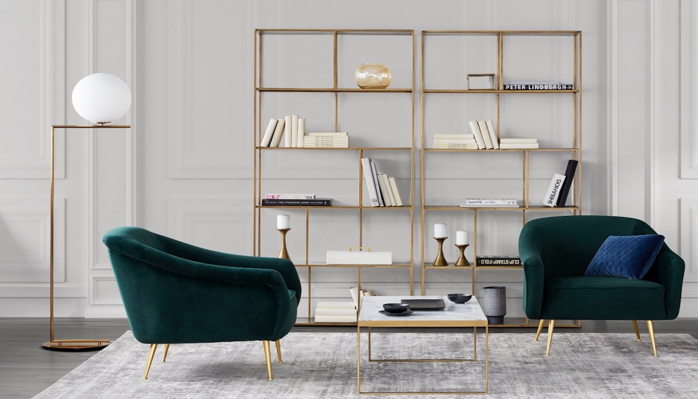
Image via Maison Corbeil
A gallery bookcase is one of the best and easiest ways to inject style into a home, and the best part is, you don’t need a lot of physical space to deck it out.
We spoke to Toronto-based interior designer Tiffany Piotrowski of Tiffany Leigh Design, who gave us her top tips on how to create a magazine-worthy bookcase layout.
Strike a Balance
Avoid placing books of similar in size in a row. “You want to go for a mix of vertical and horizontal stacks to keep the eye moving, create visual interest and avoid any heaviness on one shelf,” says Piotrowski. Placing books vertically will add needed height to a shelf, whereas placing books horizontally creates a great base for decorative objects.
Add Dimension
Once the books have been laid out, gather all the decorative elements you want to incorporate in one place, and always grab more than you need. Having everything within arm’s reach allows you to experiment and play without restriction. Piotrowski suggests shopping your own home for decorative gems, or going to a local thrift store for one-of-a-kind finds. Items like art and photography are great starting points (try hanging the art on the front edge of a bookshelf, for example, as if the shelf were a wall itself). Small sculptures, plants, vases and even lamps are all perfect for adding dimension as well. Piotrowski likes to think of bookcases like a movie: “Some shelves will have to play quieter, supporting roles, and some shelves will be leads.”
Style with Restraint
More is not necessarily merrier when it comes to styling your bookcase, so don’t overcrowd your shelves, and be sure to leave some negative space to allow the eyes to rest. Avoid having objects similar in size grouped together. For example, a trio of vases only works grouped together if each one varies in height and shape. Lastly, avoid generic items and stick to highlighting pieces you really love. The key is to create a layout that’s reflective of your personal style and not a replica of a store display.
Edit, Edit, Edit
It is virtually impossible to nail the perfect shelf on the first go. Once you think you’re done styling one shelf, Piotrowski recommends taking a photo of the display and assessing the photo. “Often, in photos, I’ll notice that those two vases will need to be spaced further apart or that basket looks too much like the box next to it. From there, I adjust as necessary.”
Looking to create a magazine-worthy layout of your own? Here’s what’s on our shopping list:
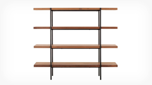
EQ3 Reclaimed Teak Shelving Unit, $1,599 at EQ3.
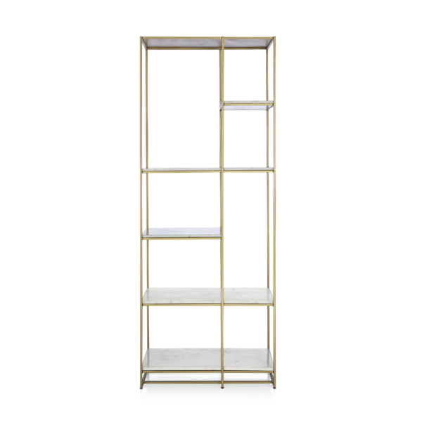
Crate and Barrel Estelle Brass and Marble Bookcase, $1,199 at Crate and Barrel.

Pharrell: A Fish Doesn’t Know It’s Wet: Transformations by Pharrell Williams, $45.56 at chapters.indigo.ca.
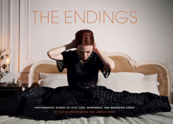
The Endings: Photographic Endings of Love, Loss, Heartbreak and Beginning Againby Caitlin Cronenberg and Jessica Ennis, $27.39 at chapters.indigo.ca.
